Designing an SVG Logo That Prints Cleanly at 30mm
A logo that looks great on a business card can disappear entirely on a 30mm keychain. Two-colour 3D printing has physical constraints that vector design doesn't — stroke widths, minimum feature sizes, and contrast all matter differently. This guide covers how to design (or fix…
By Tapora team
A logo that looks great on a business card can disappear entirely on a 30mm keychain. Two-colour 3D printing has physical constraints that vector design doesn't — stroke widths, minimum feature sizes, and contrast all matter differently. This guide covers how to design (or fix) an SVG so it prints crisp on a Tapora keychain or badge.
Why small-format 3D printing is unforgiving
A 0.4mm printer nozzle can technically print a 0.4mm line — but reliably it needs at least 0.8mm. At 30mm of print area, that means your finest feature is roughly 1/40th of the total width. Logos designed for screens or large-format printing routinely have features below this threshold, and they don't translate.
Rule 1: minimum stroke width 0.8mm
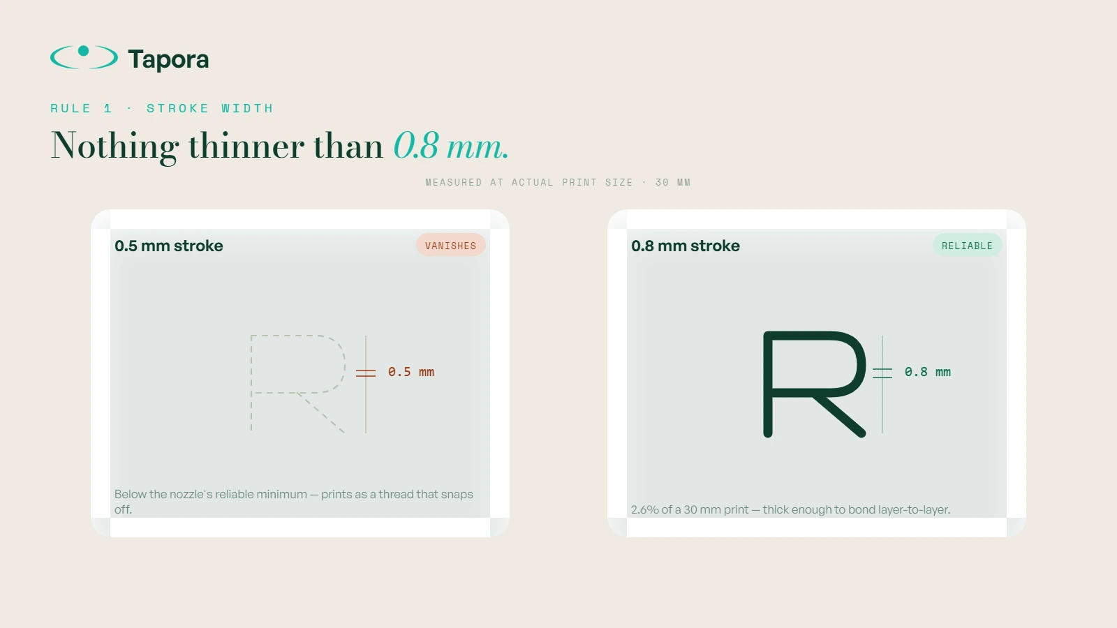
Any line, outline, or detail thinner than 0.8mm at print size will either disappear or print as a fragile thread that snaps off. For a 30mm keychain, that's 2.6% of the total width.
How to check: open your SVG in Illustrator or Figma, scale to actual print size (30×30mm or 50×30mm depending on product), and measure your thinnest line. If anything is under 0.8mm, thicken it or simplify it out.
Rule 2: minimum gap between features 1mm
Two lines that sit closer than 1mm apart will fuse together at print resolution. Tight-spaced text, serif fonts, and dense patterns all hit this limit.
Common fix: convert serif fonts to sans-serif, increase letter-spacing, or simplify dense areas.
Rule 3: contrast in colour, not in shade
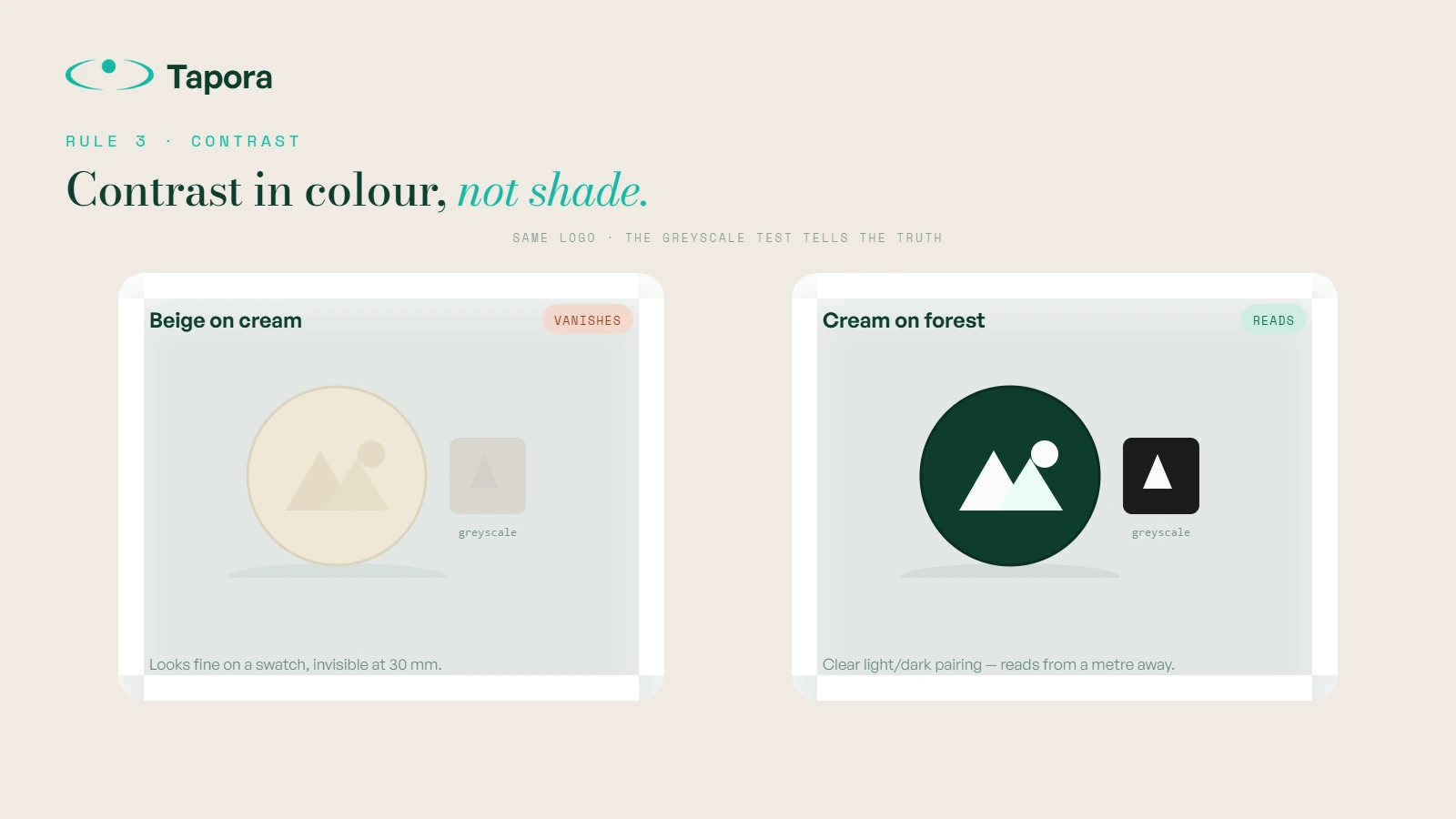
Two-colour prints work by changing filament mid-print. The two colours need to be visually distinct from a metre away. Beige-on-cream might read on a Pantone swatch — on a finished keychain, it disappears.
Rule of thumb: if a black-and-white photo of your colour choice looks low-contrast, the print will too. Aim for either a clear light/dark pairing or two strongly contrasting hues (e.g. turquoise + deep forest).
Rule 4: solid shapes beat outlines
A filled silhouette prints better than the same shape as an outline. The hammer-and-sickle as a solid icon prints great; as a thin outline, it fails. Where possible, convert outline logos to filled silhouettes.

Rule 5: avoid floating elements
A logo with disconnected pieces (e.g. a stylised "i" with a separate dot) needs each piece to print as its own contained shape. Tiny floating elements may print poorly or shift during the colour change. If your logo has loose pieces under ~3mm, consider bridging them or removing them.
File format
SVG is the format we want — vector, scalable, no resolution loss. Specifically:
- Single-path or clean-grouped paths
- No raster (PNG/JPG) embedded
- Text converted to outlines (we don't need your fonts, and we won't have them)
- Single colour fill per path (we'll split into two-colour ourselves)
Fixing a logo that doesn't pass
If your existing brand logo has thin strokes or fine detail, you have three options:
- <strong>Simplify</strong> — make a "stamp version" of the logo with thicker strokes for small-format use. Most brands already have this for embroidery or favicons.
- <strong>Use a wordmark</strong> — sometimes the brand name is more recognisable than the icon at small size.
- <strong>Use a single-letter monogram</strong> — clean, bold, prints beautifully, and instantly recognisable for established brands.
Testing before you order
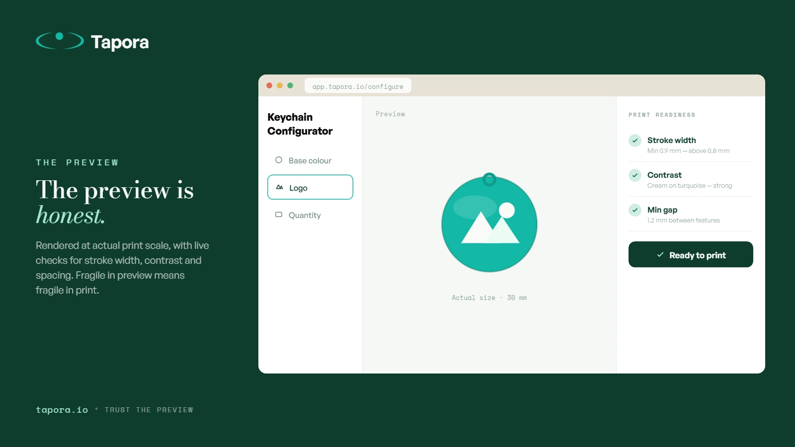
Tapora's configurator shows a preview rendered at actual print scale. If your logo looks visually fragile in the preview, it will look fragile in the print. The preview is honest — trust it.
Wrap-up
Designing for two-colour 3D printing isn't about new skills — it's about respecting physical limits the screen hides. Stroke width 0.8mm, gap 1mm, real contrast, solid shapes. Logos that follow these rules print crisp every time. Logos that don't get returned.
Continue reading
Guides
One Link, Many Destinations: Using Redirect Kinds to Run Campaigns
The smartest thing you can do with an NFC tag is not hardcode the destination. Tapora links don't point to your final URL — they point to a short URL you control, which means the same physical tag can route to a menu in January, a Valentine's promo in February, and a Google re…
Guides
Shipping From Malta to the EU and Beyond: What to Expect
Tapora prints and ships every order from Malta. For customers in Malta itself, that means next-day delivery. For the EU, it usually means 3–5 working days. For the rest of the world, it depends — and this post explains exactly what to expect, what we charge, and how customs ar…
Guides
PLA vs PETG vs ABS: Choosing Filament for Everyday-Carry Items
Three letters decide whether your 3D-printed keychain survives summer in a hot car or warps into a crisp by July. PLA, PETG, ABS — each has different physics, different feel, and different failure modes. Here's how we choose, and why Tapora prints in the materials we do.